
Whether you have started React Native recently or you are a senior React Native developer, responsiveness is always a serious and required problem in mobile app development. Like web development, the subject is so important and inevitable in mobile apps. Although React Native uses density-independent pixels (known as briefly dp), it doesn’t have the same behavior on different devices.
What we can do to make our applications responsive (layouts, fonts, etc) and have easy development? In the following, I’ll show you how you are able to have both of those together.
From version 1.x.x of the package, you could use methods like rs, rw, or rh (or the provided hooks) to make the property responsive. You can find more information about them in the usage documentaion. However, I am excited to introduce a new feature that I recently had the opportunity to work on. This feature is part of the newly released version 2.1.0 and fills a void that had been strongly felt!
This feature involves the creation of a responsive stylesheet as easy as possible instead of using React Native StyleSheet.create method. But before we discuss this new feature, let’s have a brief introduction to the package.
The package makes it incredibly easy to create responsive apps that work seamlessly on various screen sizes in React Native. It covers aspects such as font size, width, height, and more, ensuring that everything appears visually appealing on any device, ranging from extra small to extra large. Additionally, you have the flexibility to fine-tune the scaling and adjust settings to achieve the desired appearance.
Features
- Easy to use: Effortlessly implement size scaling and responsive design.
- Cross-platform: Works seamlessly across multiple platforms and devices.
- createRStyle method and useRStyle hook as alternatives to using
StyleSheet.createfor create stylesheets. - Various responsive hooks provided: Use these hooks based on your specific use cases.
- Customizable scaling: Define base widths for specific dimension types
(xs, sm, ... 2xl)for precise control. - Responsive percentage-based sizing: Adjust sizing based on width or height by
PixelRatio. - Media query hook: Detect dimension types by using the useMediaQuery hook. You can also override default thresholds as needed. This hook can be used in the provider to automatically detect and respond based on the configurations.
- Various responsive Higher-Order Components (HOCs) provided: Utilize these methods in your class components.
- Written in TypeScript and fully typed.
Installation
First install the package by package manager that you like:
yarn add react-native-full-responsiveOr by NPM:
npm install react-native-full-responsive --saveNow that we are familiar with the package, let’s learn about createRStyle and useRStyle and delve a bit deeper into them!
createRStyle
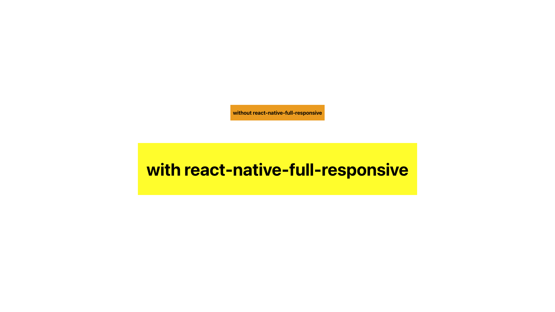
Or better to say create responsive style, is a method used to generate a responsive stylesheet with specific patterns. react native full responsive offers three main methods: responsive scale (rs), responsive width (rw), and responsive height (rh). By specifying the value using number(rs|rw|rh) pattern, you can easily achieve a responsive style for a particular property. To illustrate this concept more clearly, and have a good vision to compare with StyleSheet.create please refer to the following example:
import * as React from 'react';
import { StyleSheet, View, Text } from 'react-native';
import { FRProvider, createRStyle } from 'react-native-full-responsive';

const SIZE = 20;

const Box: React.FC = () => {
  return (
    <View style={styles.box}>
      <Text style={styles.textBold}>without react-native-full-responsive</Text>
    </View>
  );
};

const ResponsiveBox: React.FC = () => {
  return (
    <View style={rStyles.box}>
      <Text style={rStyles.textBold}>with react-native-full-responsive</Text>
    </View>
  );
};

export default function App() {
  return (
    <FRProvider type="sm">
      <View style={styles.container}>
        <Box />
        <ResponsiveBox />
      </View>
    </FRProvider>
  );
}

const styles = StyleSheet.create({
  container: {
    flex: 1,
    alignItems: 'center',
    justifyContent: 'center',
  },
  box: {
    height: SIZE * 3,
    marginVertical: SIZE,
    justifyContent: 'center',
    backgroundColor: 'orange',
    paddingHorizontal: SIZE / 2,
  },
  textBold: {
    fontWeight: 'bold',
    fontSize: SIZE,
  },
});

const rStyles = createRStyle({
  box: {
    height: `${SIZE * 3}rs`,
    justifyContent: 'center',
    backgroundColor: 'yellow',
    marginVertical: `${SIZE}rs`,
    paddingHorizontal: `${SIZE / 2}rs`,
  },
  textBold: {
    fontWeight: 'bold',
    fontSize: `${SIZE}rs`,
  },
});
For the number mentioned in the pattern, you can also use signed numbers (integer or float). Therefore, for a more detailed pattern, it follows the format:
(+|-)(integer|float)(rs|rw|rh)
createRStyle also accepts a second argument, which is include:
width
To use custom dimensions width for the calculation
height
To use custom dimensions height for the calculation
scaleConfig
To use a specific responsive scale method configuration for applying when using rs for style properties to specify the current type and custom bases, familiarize yourself with the type and bases by checkinghere
method
To specify the parsing styles method, in this case, the recursive method is generally faster than the linear method (although the algorithm is not strictly linear, it has the potential for linear time complexity and is called linear). However, for deep and large structured objects, the linear algorithm may be more appropriate.
Possible values: recursive | linear
Default: recursive
When using the linear method, it parses the style by using a loop iteration and an inner stack instead of direct recursion. However, as mentioned above, the recursive method is faster for this purpose.
useRStyle
A hook is provided for createRStyle to create a dynamic responsive scale. This hook generates a new style when there are changes in dimensions, the parsing method, type, or bases. It requires two arguments:
- The first argument is the style
- The second argument is the parsing method which is optional and the default is recursive
An example:
import * as React from 'react';
import { View, Text } from 'react-native';
import { FRProvider, useRStyle } from 'react-native-full-responsive';

const SIZE = 20;

const ResponsiveBox: React.FC = () => {
  const styles = useRStyle({
    container: {
      flex: 1,
      alignItems: 'center',
      justifyContent: 'center',
    },
    box: {
      height: `${SIZE * 3}rs`,
      justifyContent: 'center',
      backgroundColor: 'yellow',
      marginVertical: `${SIZE}rs`,
      paddingHorizontal: `${SIZE / 2}rs`,
    },
    textBold: {
      fontWeight: 'bold',
      fontSize: `${SIZE}rs`,
    },
  });

  return (
    <View style={styles.container}>
      <View style={styles.box}>
        <Text style={styles.textBold}>My awesome responsive text!</Text>
      </View>
    </View>
  );
};

export default function App() {
  return (
    <FRProvider type="sm">
      <ResponsiveBox />
    </FRProvider>
  );
}
I hope this package helps you achieve better results and improves your development experience for responsiveness in React Native
Github repo: https://github.com/Mhp23/react-native-full-responsive
Usage documentation: https://github.com/Mhp23/react-native-full-responsive/blob/main/USAGE.md